The living brand system for Wire Point Group. Every logo, color, typeface, and rule from the brand guidelines, in one place. Click any color or phrase to copy it. Click any file to download it. Not sure what you need? Press / and type.
Wire Point Group began with Gus: a wirehaired pointing griffon who was patient, disciplined, and always focused on what mattered. He didn't chase every scent or rush toward every opportunity. He searched, found his point, and held steady.
Wire Point Group is a brand advisory for founders, people who are capable, confident, and moving fast. Sometimes too close and too fast to see the whole picture themselves. We hold the bigger picture while they keep running the business well.
The philosophy, and the internal mantra. Click to copy.
1.4 · Positioning
A brand advisory for founders who are too close to see the whole thing.
1.2 · Brand DNA · A tension held, not resolved
The handmade
Marks with the imperfection of something drawn by hand. A little weathered, a little worn in. The icons and logos hold this rough, hand-drawn quality.
and
The premium
Felt in the material and the make. Premium but not pretentious. Everything around the marks goes this way: editorial layouts, generous negative space, room to breathe.
The two stop competing and start setting each other off. That tension is the brand.
1.3 · Brand OS · Four principles carry it
01
Calm & confident
We make statements with a smile, never with self-importance. The boldness is rooted in experience, not volume.
02
Precision over speed
We find the one thing worth doing before we move.
03
Direction > distraction
There will always be another opportunity or idea. The work isn't to chase them all, but to know which is worth following.
04
Strength without aggression
Bold, a little rugged, never brash. We hold the point. You call the shot.
1.5 · Personality · How the brand carries itself
Weathered, not worn out
There's history in the marks, but the whole thing feels cared for.
Warm, but not soft
Approachable without losing its edge.
Composed
Everything sits in its place. Nothing is crowded, nothing shouts.
Understated
Premium is felt, not announced. We let the material and the make do the talking.
02 · Voice & Key Phrases
Assured. Calm, precise, warm.
It sounds like someone sharp and steady who means what they say. No jargon, no hype. Candid enough to say the thing nobody in the building has said out loud, and to say it plainly.
1.6 · Tagline & key phrases · Click any card to copy the line
How we speak
AssuredClear and direct. Statements, not guesses. Not loud, not shy. Certain.
Warm & plainspokenInviting and unfussy. A steady companion, not a consultant hiding behind jargon.
GroundedWords stay close to the real: the field, the work, the material. No reaching for flourish.
ConsideredWe say the one thing worth saying. Precision over volume.
Before anything goes out
Would we say this out loud, to one person, across a table?If it sounds like a pitch or a press release, rewrite it plainer.
Is every word doing work?Cut the inflation, the buzzwords, and the filler. What's left is usually the real sentence.
Are we making the reader move, or letting them decide?We give direction and let the founder call the shot.
When in doubt, say less.
The copy scale · Functional → Pointed → Lyrical
The same message shifts along the scale depending on the job. Click any line to copy it as a starting point.
PointedClear, with more expression. Consideration-stage moments.
LyricalEvocative, room for sentiment. Covers, signage, the website's opening line.
Copy don'ts
Don't oversell or inflate
"We're the #1 game-changing brand agency delivering unparalleled results."
"We help you find the one thing worth doing next."
Don't hide behind consultant jargon
"We leverage synergistic frameworks to optimize your brand ecosystem."
"We look at the whole picture and name what matters."
Don't rush or push urgency
"Act now! Don't miss this opportunity to transform your business!"
"There's always another opportunity. The work is knowing which one to follow."
Don't overwork the dog metaphor
"Let us sniff out your brand's scent and fetch your success!"
"We hold the point. You call the shot."
Gus is philosophy, not a mascot to pun on. Reference pointing and steadiness. Never make the dog talk or "fetch."
03 · Logo System
Twelve marks. One system.
Same hand-drawn griffon, same Native Record type, same palette. Each mark is built for a different job. Pick a colorway on any card, then download SVG for digital, PNG for quick use, or PDF for print.
2.4 · Choosing the right mark
Logo finder
Start with the piece, not the logo. Answer a few questions about what you're making and it points you to the mark, with the download ready.
This is a guide, not a law.
Preview on
Supporting elements
The gate icon and the two containment frames. The stamp and shield are the only shapes a photo may be cropped into (4.10). Use these files, don't redraw them.
Clearance & placement
Keep clear space on every side, set by each mark's own artwork (listed on each card). Nothing enters that space: no text, no other logo, no page edge. These amounts are a floor. When the format allows, give it more.
The mark sits in a fixed position, never floating or centered by eye. On print, anchor it to a corner or the optical center of the margin grid. On screens, hold its place in the nav or header. On a photo, place it over the calmest part of the frame.
Tips that help
Give it airCrowding is what makes a good mark look cheap.
Match weight to surfaceThe rougher or smaller the surface, the simpler the mark.
Contrast firstThe mark has to read before it has to look good.
One mark per pieceDon't mix two logos in one layout. Commit.
What to avoid
01Don't stretch or squeezeScale locked, always. If it doesn't fit, choose a different mark.
02Don't recolor freelyOnly the approved colorways. The palette is part of the drawing.
03Don't add effectsNo shadows, glows, bevels, outlines, gradients. The woodcut is the only texture.
04Don't rotate or tiltUpright, always. Gus stands on point. He doesn't lean.
05Don't take it apartNeed just the dog or just the name? Use the mark built for that.
06No busy backgroundsA calm, high-contrast field, or a solid brand-color plate behind it.
07Don't cage itNo circles, rounded cards, or chips behind it. The Oval Seal and Banner Crest are the frames.
08Check final sizeZoom to real size before you decide. Never below the minimum on the card.
04 · Color
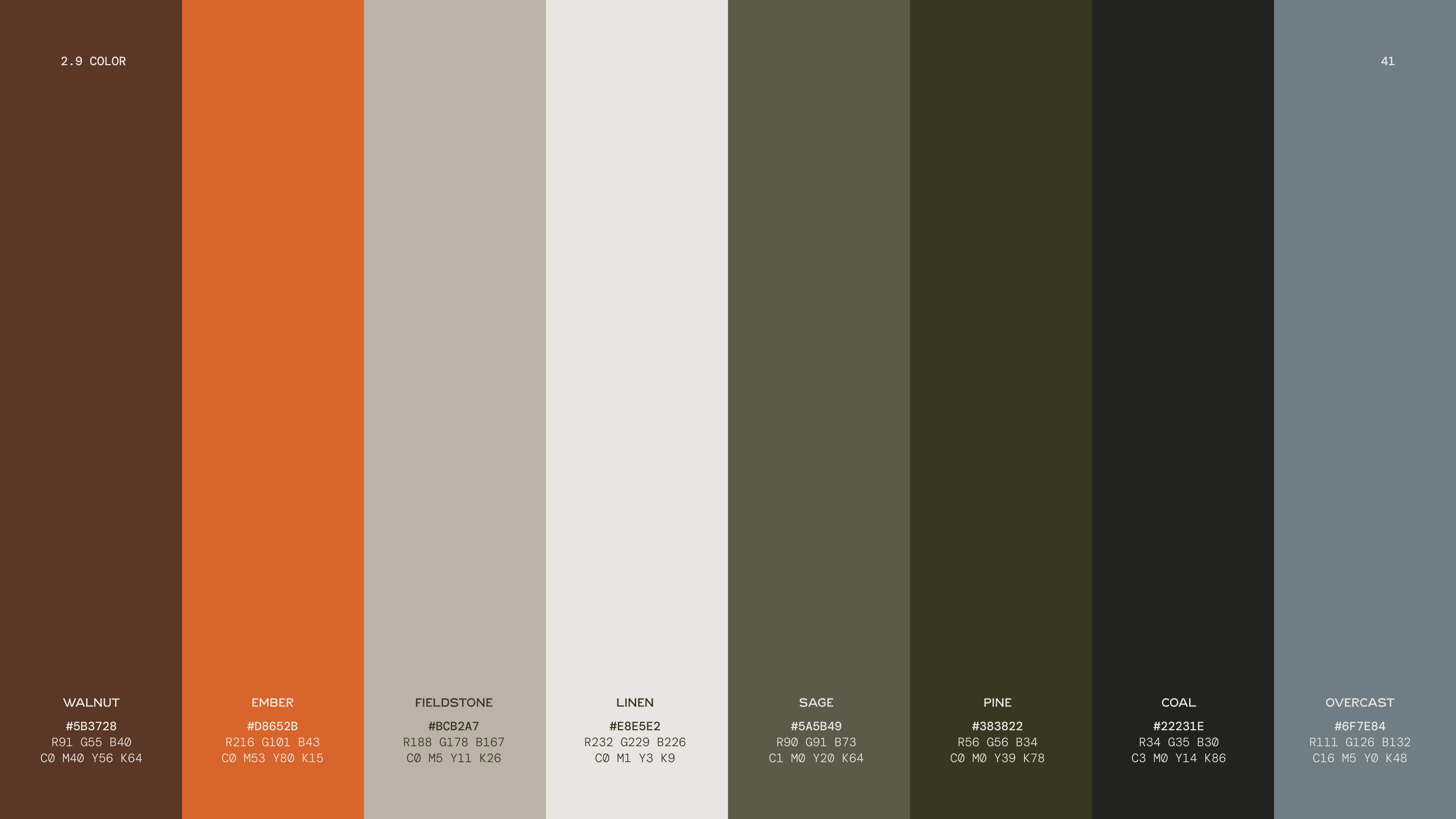
Sage and Linen carry. Coal and Ember stay rare.
Click a swatch to copy its hex. Use the chips for RGB or CMYK. Start from the role, and let the meaning confirm the choice.
For charts, data, and UI states that need more than one step. Lighter steps move toward Linen, darker toward Coal, so every shade still speaks the system's language. Click any step to copy it.
Contrast & accessibility
Measured WCAG ratio for every pair. Hover to preview, click to copy the pairing. If you can't tell two colors apart at a squint, that pairing stays away from text and the mark.
✓ AA body text (4.5+)● Large text only (3.0+)✗ Backgrounds and accents only
Pre-approved pairings
Cleared for text, ready to use. Click to copy both hexes.
Ember is never text, with one exception: a small label or callout on Coal (4.38:1, large-text level). Everywhere else Ember stays a shape, a line, a small detail.
05 · Typography
Native Record speaks. DM Mono shows the work.
Two typefaces, each with a job. Native Record carries the voice: headlines and editorial moments. DM Mono carries the data: labels, long copy, captions, fine print.
Serif + MonoThe default. Serif headline, DM Mono for body and captions. Editorial pages, decks, one-pagers.
Serif + Sans + MonoThe full hierarchy. Serif leads the headline, Sans supports as subhead, Mono carries the copy. Serif always leads, never the reverse.
Sans + MonoStructured, data-forward layouts: dashboards, spec sheets, tables. Sans leads alone, no serif on the page.
Script never pairs as a second lead. It sits inside a layout already led by Serif or Sans, as the one emphasized word.
Type scale calculator
Size is a ratio, not a fixed measurement. Set the headline to whatever the layout needs and the rest follows (2.16). Click a size to copy it. A guide, not a formula: if it feels cramped, move it.
Headline size
40
Leading: headlines 100 to 110%, labels 120 to 130%, body 140 to 150%.
Typesetting
Tracking0 for Serif and Sans at headline and body sizes. Add a touch of positive tracking to all caps, small sizes, and DM Mono.
LeadingHeadlines tight, about 100 to 110%. Body copy 140 to 150%. Captions and labels 120 to 130%.
CaseSerif and Sans headlines in ALL CAPS. Body in sentence case. Script in Title Case, never caps. CTAs flex.
AlignmentBody copy justified. Headlines and short lines left-aligned. Centered only for a short, ceremonial line.
What to avoid
01Don't fake a styleNo slanted "italic" or synthetic bold. If the cut doesn't exist, don't fake it.
02Don't stretch typeResize the container or the type size, never the letter shapes.
03No two leadsSerif and Sans both at headline weight fight. One leads.
04No Script at lengthA word or two, title case. Never a sentence.
05Don't crowd capsOpen the tracking slightly on any all-caps line.
06Don't center bodyJustified for paragraphs, left for short lines.
07No effectsNo shadows, outlines, glows, or gradients. Flat, as drawn.
Licensing: read before sending to a vendor
Free · SIL OFL 1.1
DM Mono
Free and open source via Google Fonts. Commercial, web, and app use with no purchase needed. If you redistribute the files, keep the license notice with them.
Covers print and digital collateral: logos, stationery, decks, PDFs, merch, and static images where the type is flattened. It does not cover embedding the font in a website (@font-face), an app, or an e-pub. That needs a Webfont, App, or E-Pub license first.
Not a library of templates to copy. The reasoning behind every WPG layout, so a new one can be built from scratch and still belong. Whatever you're making, the same four questions decide it.
Question 01Where do two things meet, or do they?Intersection or Zones. Decide before placing a single element.
Question 02What locks together?Text and image lock into one block, edge to edge. Sitting near each other is not a WPG layout.
Question 03What's loud, and what's quiet?One large, quiet element. One small, precise one. Never both at the same scale.
Question 04What holds it all in place?One grid, top to bottom. Every alignment checkable, not eyeballed.
The junction
3.3
Intersection
Elements deliberately cross: a fold, an edge, the seam between photo and color field. The one focal element goes exactly at the junction. Use it when a single message needs energy.
3.4
Zones
Nothing overlaps. Every element holds its own closed rectangle, stacked edge to edge, matching widths. Use it when several things all need to read cleanly.
Scale contrast
One loud, one quiet, never both. Large and quiet sets the register (a wordmark blown up as texture, a color field). Small and precise delivers the fact. Size signals register, not importance.
Grid discipline
One set of margins and columns governs every element. Margins are a floor, not a target. A piece might only touch two or three grid lines. "Looks close" is where grid discipline fails.
Negative space
Emptiness is a decision, not a leftover. When in doubt, open the layout up. If it feels like it's missing something, the fix is rarely another element. It's more space.
What to avoid
01Don't center by defaultFind the intersection or build a zone. Centering is a decision, never a fallback.
02Don't half-commitPick Intersection or Zones for the whole layout.
03Don't let locked edges driftAlmost the same width is the same as wrong.
04No equal scaleTwo elements the same size means nothing leads.
05Don't eyeball alignmentEvery edge sits on a grid line.
06Don't fill spaceEmpty space is allowed to stay empty.
07Loud isn't importantA small, precise element still leads when set correctly.
07 · Creative Direction
American Southern. Referenced, never pinned down.
Quail country: longleaf pine, broomsedge in December, a fence row pasture. A photo doesn't need to have been taken there. It needs to feel like it could have been.
CompositionWide, open, level. Subject small in a large frame. Natural framing, leading lines, layered depth. Level horizon, always. No dutch angle.
LightWarm, hazy, generous. Golden hour by default. Haze and light leaks are welcome. Wide shots soft and low-contrast; tight shots can go more graphic.
PeopleGenerally avoided. If someone's in frame, never a face or expression. Hands, backs, feet, motion. No silhouettes.
Find the quiet spot first: open sky, clean field, no clutter. It also needs contrast with what goes on top. A light element needs a dark, quiet area under it. If the photo doesn't give enough, lower the exposure there. Manufacturing contrast is a normal part of the process.
Containing a photo
Two ways, nothing else. The default is a large, solid rectangular block with generous room around it. For texture, the serrated stamp or the shield, kept rare. Never a circle, rounded card, or custom cutout. Frame files ↓
08 · In Use
The thinking, landed somewhere real.
Pre-approved mockups, reference photography, and the brand launch social set. Treat these as reference, not new rules. Click any image to view it large and download.
Every file in the brand package. Logo packs include every colorway in SVG, PNG, and PDF.
10 · Tokens
For developers and designers.
The palette, shades, font stacks, and type ratios as code. Copy it or download the file. Native Record's desktop license does not cover @font-face: on the web, use flattened graphics (as this site does) or buy the webfont license.